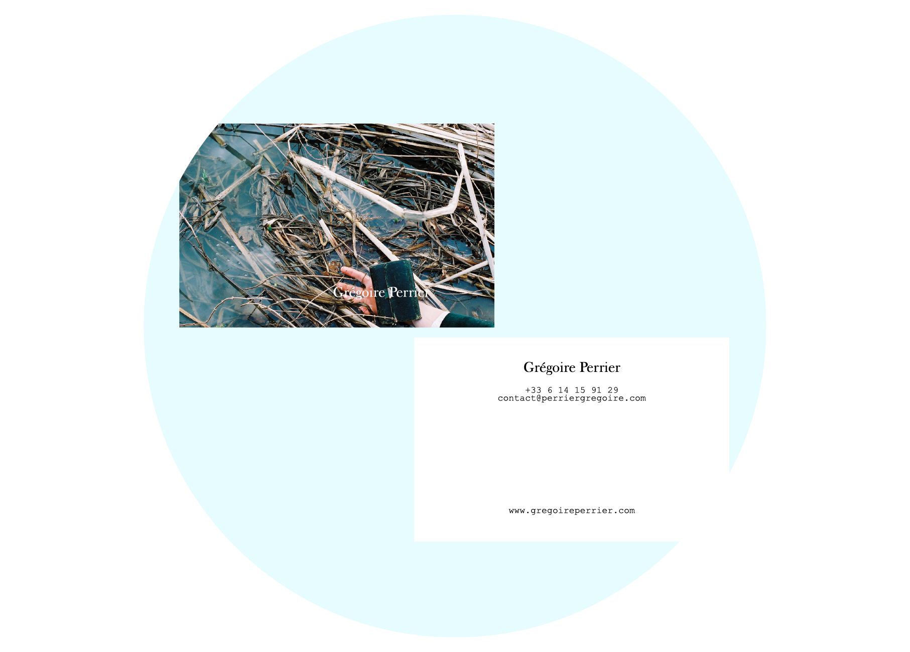
Grégoire Perrier
Spring 2009
Paris, FRANCE
Brand Identity, UX/UI Design
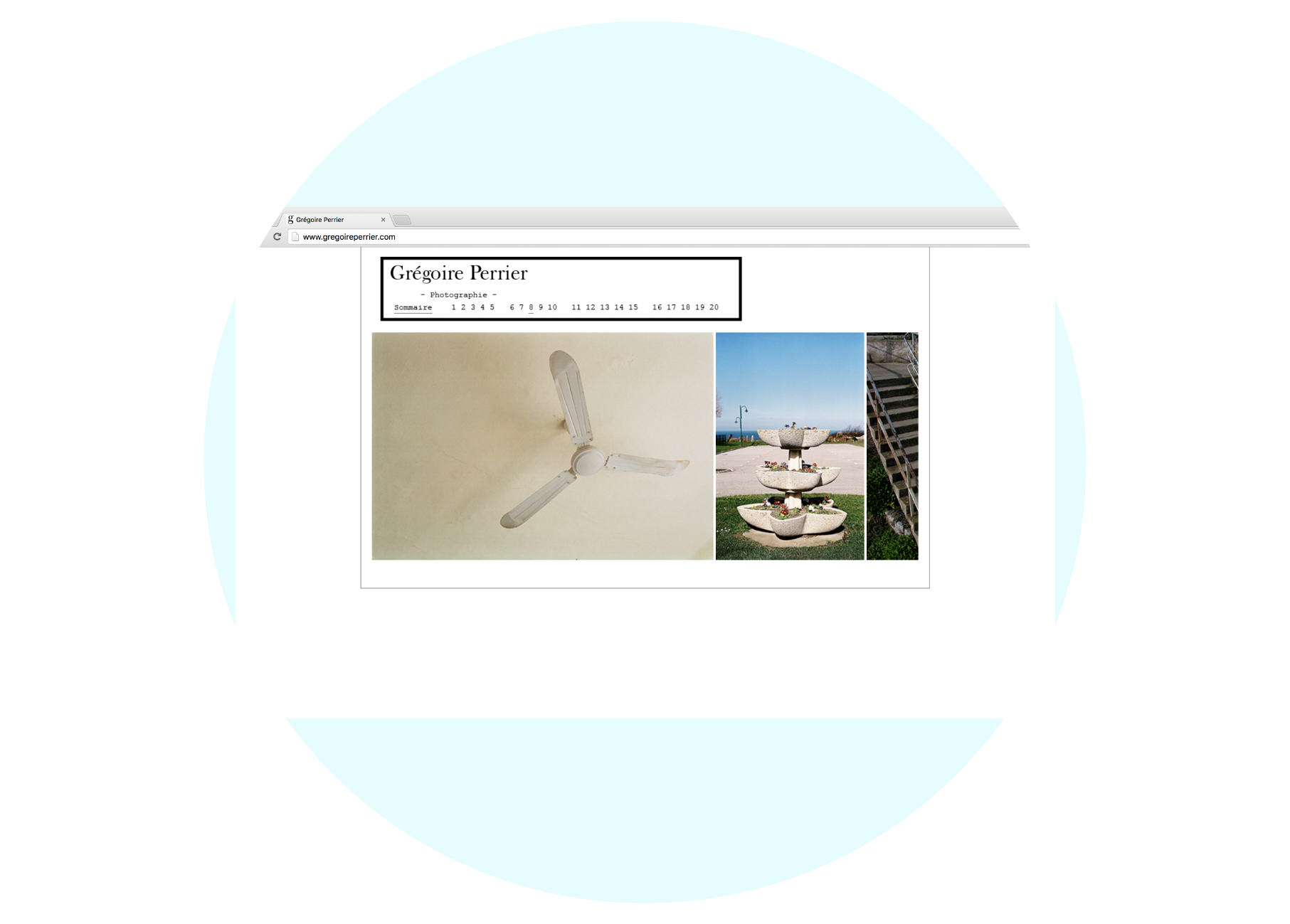
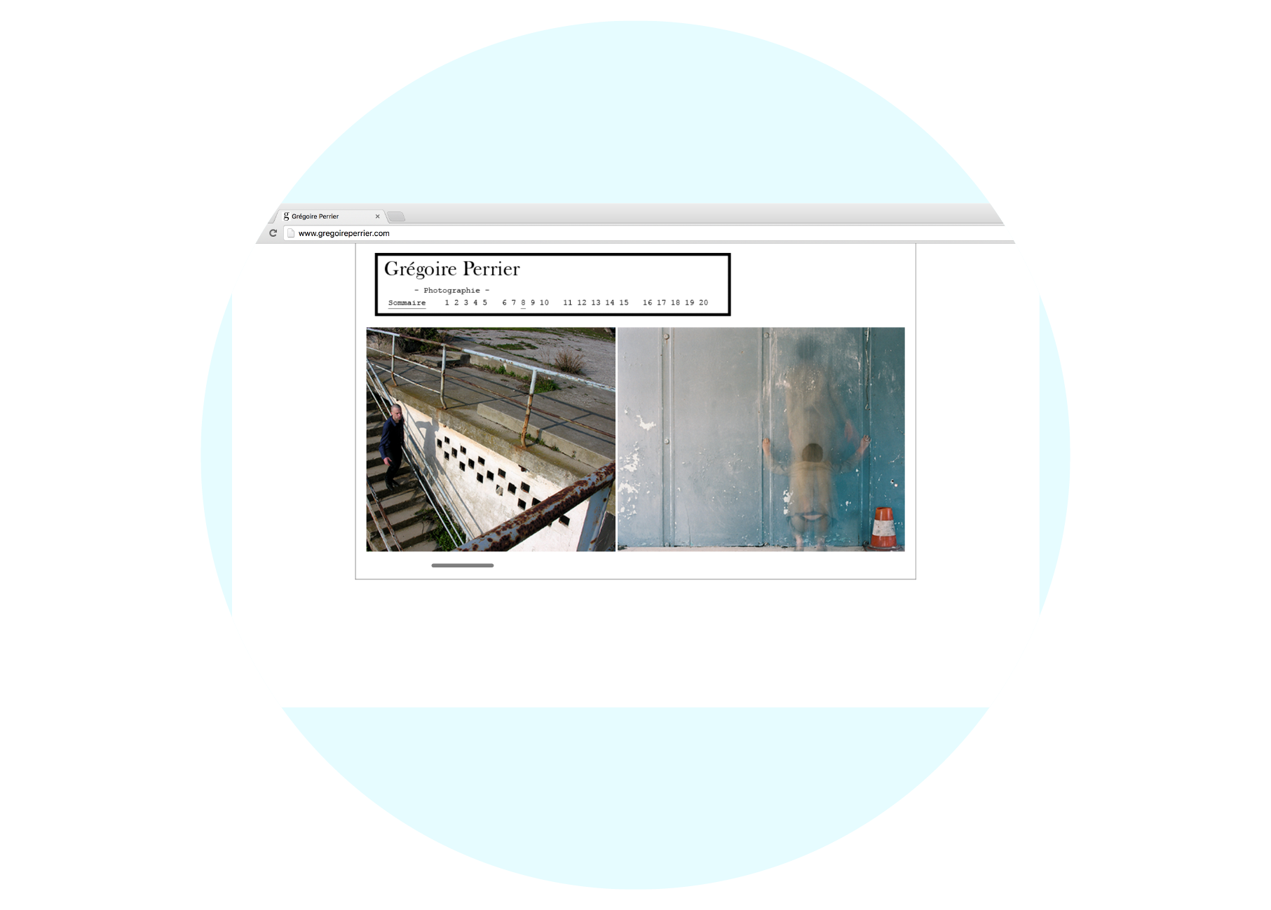
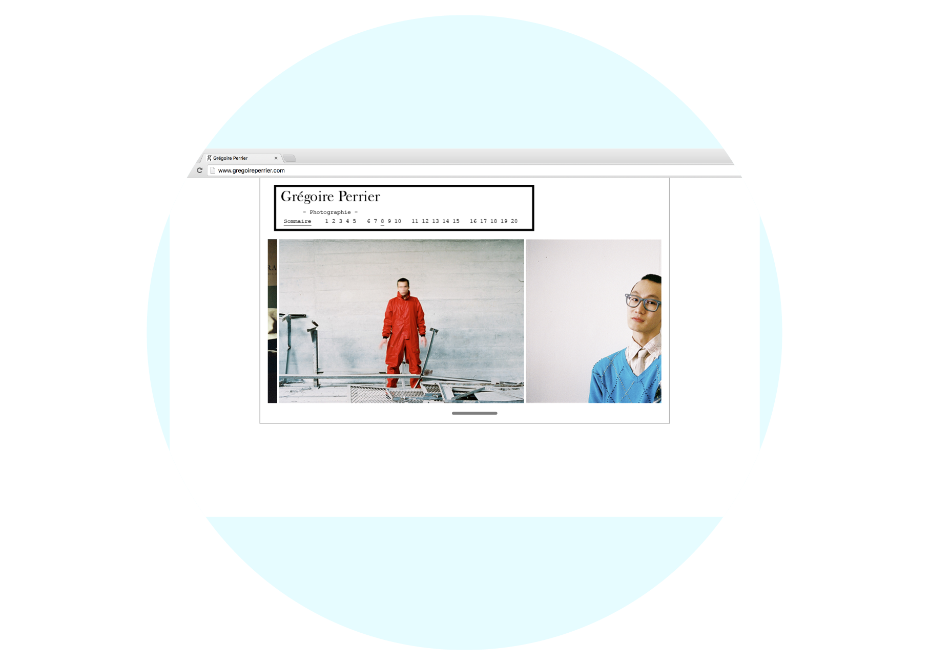
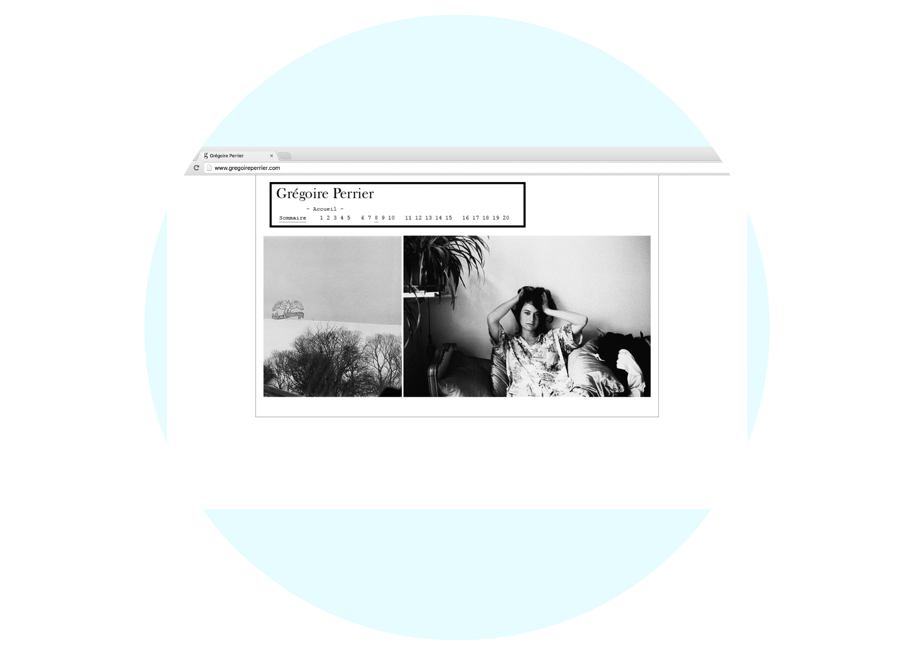
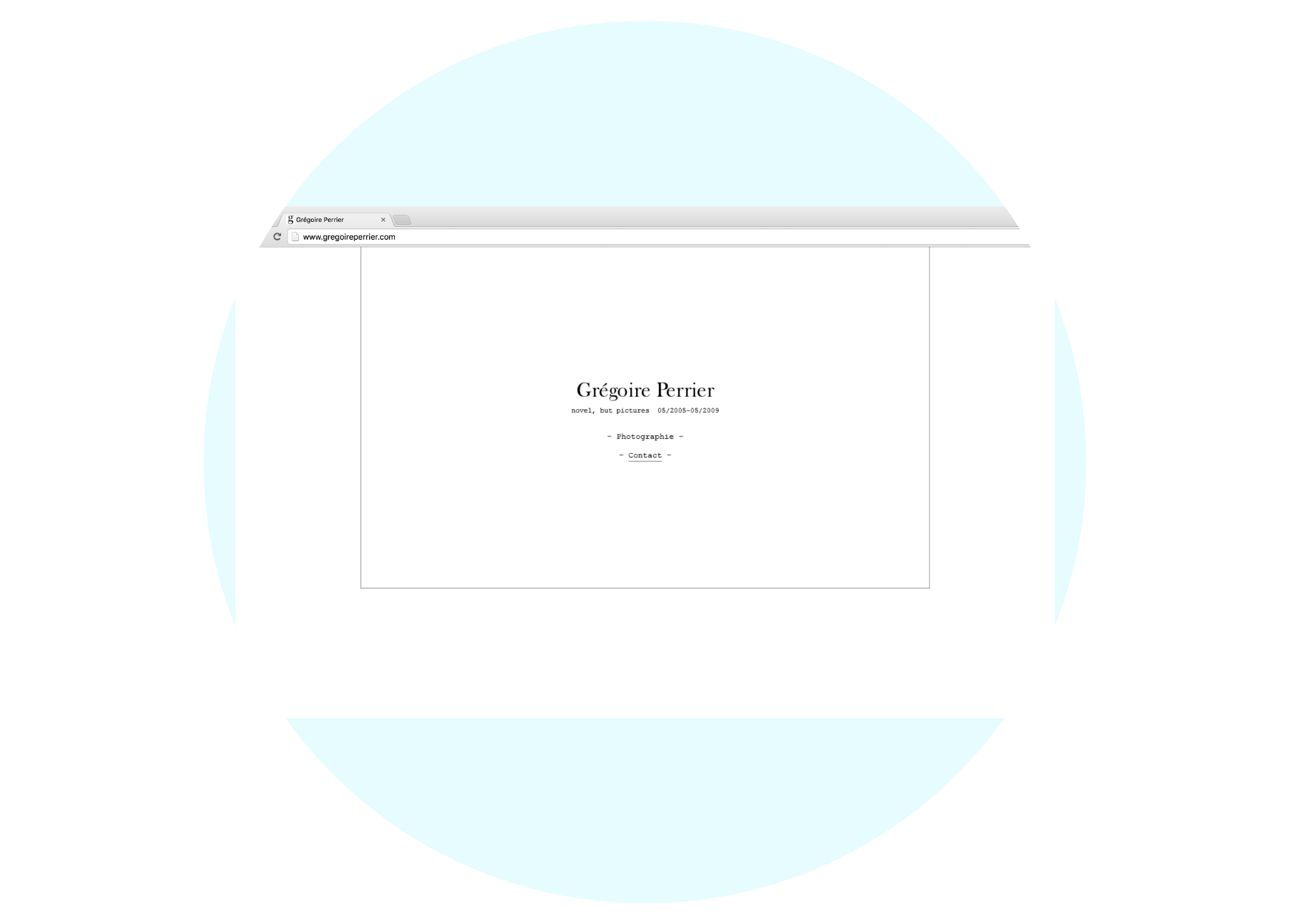
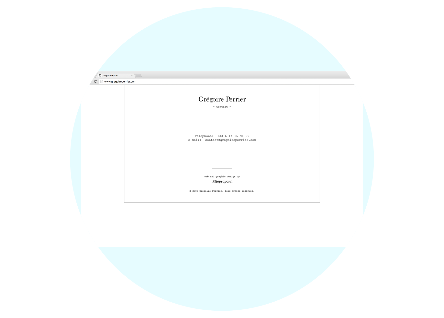
Brand Identity and online portfolio UX/UI design for Parisian photographer Grégoire Perrier.
Design of the brand identity refers to the typeface that was used on the book cover of one of the photographer’s favourite novels “Aurélien” by Louis Aragon, classic & simple.
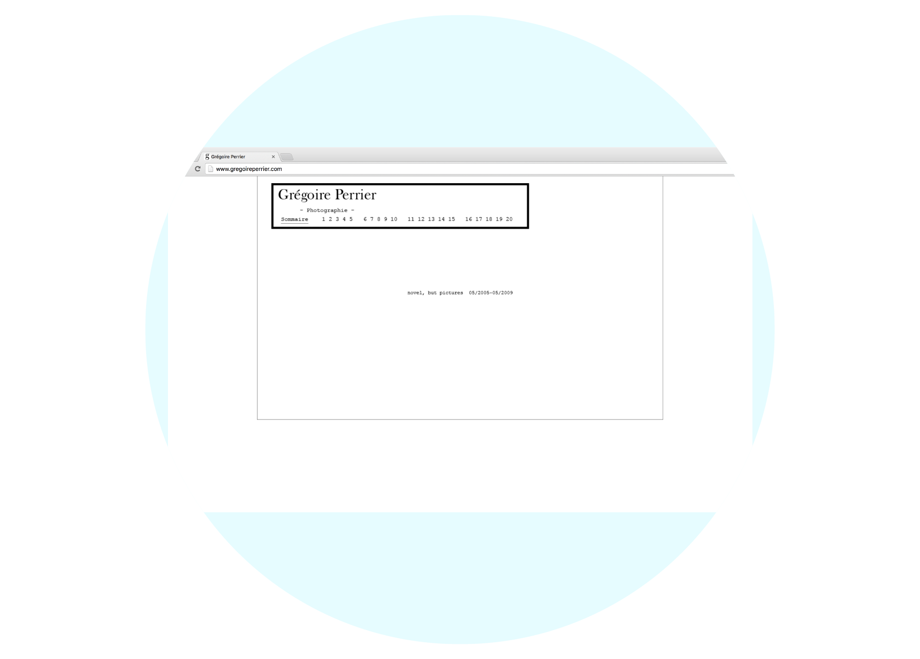
The website is intended primarily for professionals or a public that already has a sensitivity to aesthetic concerns.
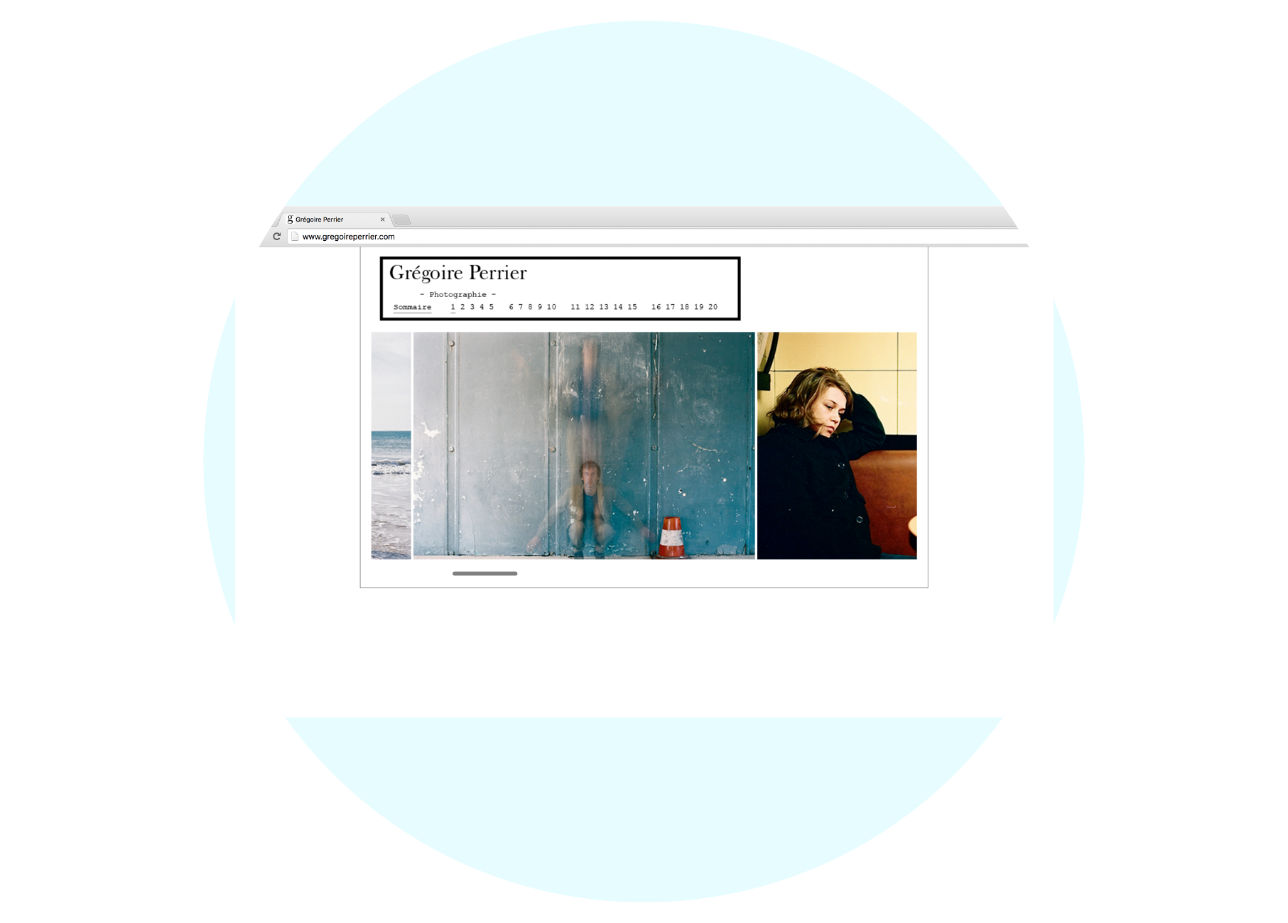
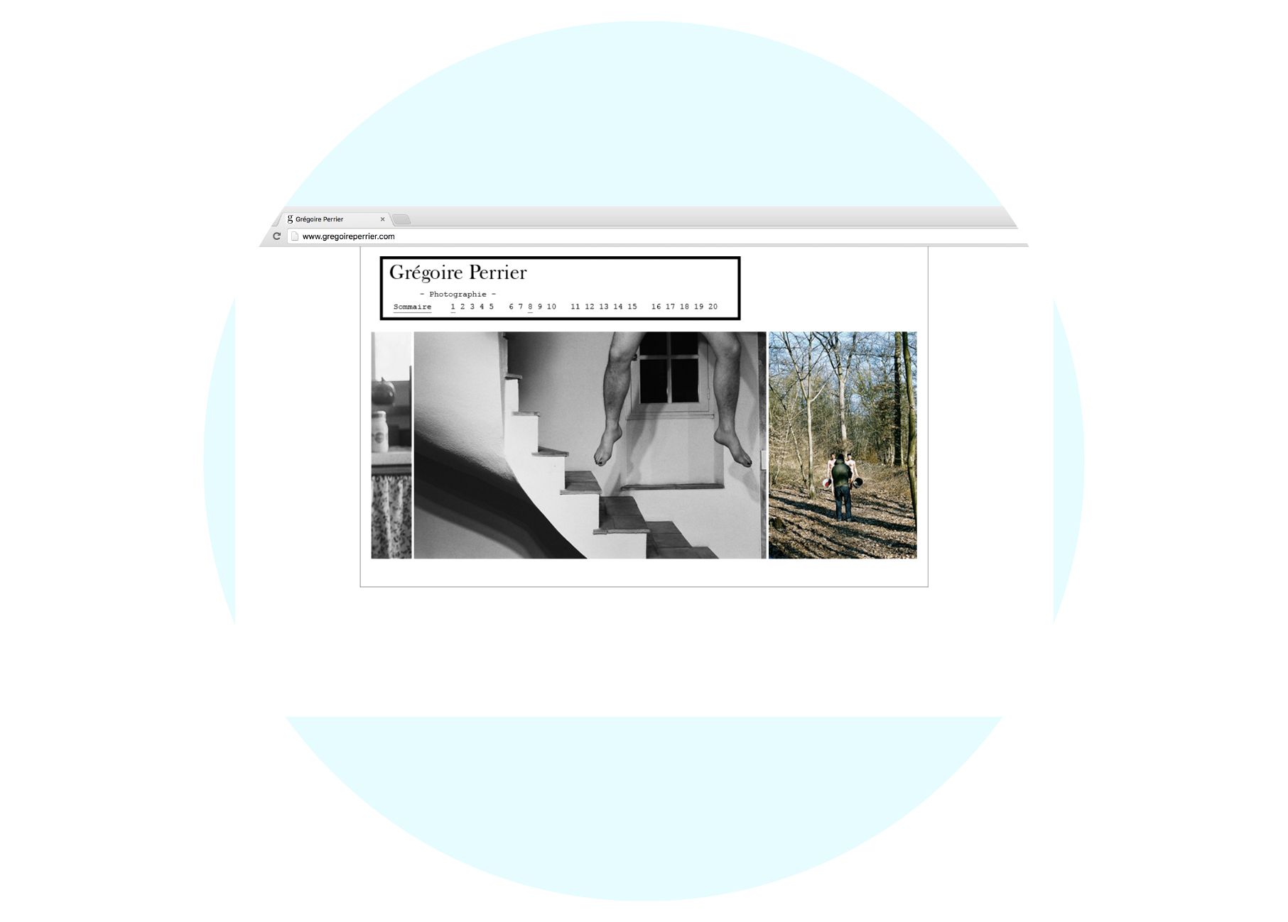
The aim of the site is to present works & collaborated projects that reflect the thinking process of the artist and represent the core idea of neutral, classic and novelistic.
It was designed to his wish of creating a novel like showcase, composed with his photography works in chapters, each chapter being one montage of fantasy.
gregoireperrier.com
( new tab redirects to archived version )